
Back to projects

Architecture website case study

Anica Cvetkovic Studio

A premium digital portfolio for a luxury modular architecture studio, built to communicate calm, precision, privacy and trust before the first client conversation.

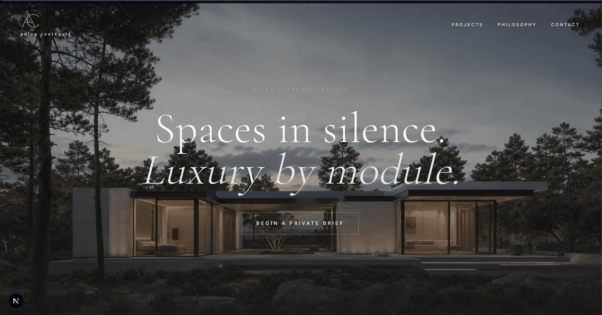
Anica Cvetkovic Studio website hero for luxury modular architecture

Project overview

A premium portfolio for a studio selling quiet confidence.

Anica Cvetkovic Studio is a conceptual architecture brand focused on luxury modular homes, private residences and interiors that combine precise prefabrication with the warmth of natural materials.

The goal was not just to create a beautiful website. The site needed to feel like entering the house itself: spacious, quiet, carefully composed and serious enough for clients considering a high-value private residence.

The result is an editorial portfolio with large visuals, cinematic movement, discreet typography, architectural blueprint details and a clear path toward a private brief.

WebProject type
QuietBrand tone
FullDevice support

Experience strategy

Quiet luxury by module, translated into a focused web journey.

  1. 01Lead with a full-screen architectural scene
  2. 02Establish the studio's philosophy around quiet luxury
  3. 03Connect modular precision with warm residential atmosphere
  4. 04Show projects through an editorial portfolio rhythm
  5. 05Use blueprint details to signal method and technical control
  6. 06Guide serious clients toward a private brief enquiry
Positioning

A website that sells trust before the first meeting.

For a premium architecture studio, the first impression needs to carry more than information. The site positions Anica Cvetkovic Studio as a discreet, high-value brand for clients considering private residences and significant design investments.

  • Premium modular architecture positioning
  • Tone built around privacy, calm and precision
  • Messaging for clients making high-value decisions
  • A focused path toward a private enquiry
Art direction

Quiet luxury expressed through image, space and proportion.

The visual system avoids the feeling of a generic portfolio template. Large architectural imagery, warm mineral backgrounds, bronze accents and restrained typography create a calm editorial experience.

  • Large cinematic architectural visuals
  • Light mineral background with dark text
  • Bronze and gold accent details
  • Serif display typography with clean body text
  • A measured grid with generous negative space
Portfolio

Projects presented like an architectural monograph.

The portfolio is shaped as a curated editorial sequence rather than a simple gallery. The layout gives the work a stronger sense of selection, value and authorship.

  • Asymmetric editorial project grid
  • Visual emphasis on homes, materials and atmosphere
  • Architecture-led hierarchy instead of catalog browsing
  • A calmer rhythm that lets the projects breathe
Method

Blueprint details connect beauty with precision.

A custom architectural blueprint element supports the studio's modular methodology. It helps prefabrication feel considered and premium rather than cold or industrial.

  • Custom architectural SVG blueprint
  • Visual proof of process and technical thinking
  • Connection between modular logic and refined living
  • A stronger bridge between aesthetics and engineering
UX

Simple navigation keeps the experience focused.

The site is intentionally not overloaded with text. Visitors can move quickly between projects, philosophy and contact, while the main CTA is framed as the beginning of a confidential design process.

  • Navigation focused on Projects, Philosophy and Contact
  • Private brief language instead of a generic enquiry
  • Reduced copy density for a more exclusive feeling
  • Responsive layouts for desktop and mobile visitors
Business value

A digital presence that supports premium perception.

The finished experience gives the studio more than a portfolio. It becomes a sales tool that raises perceived value, differentiates the brand and attracts better-fit conversations.

  • Stronger premium brand positioning
  • Clearer differentiation from generic studio websites
  • A more elegant frame for projects and materials
  • Better foundation for future CMS or multilingual growth

Technical foundation

Built as a modern, expandable portfolio experience.

The website is built as a focused Next.js application with React architecture and Tailwind CSS styling. The structure is light, responsive and ready to grow into a larger portfolio, CMS-backed website, multilingual presentation or production lead system.

The implementation includes optimized local imagery through Next Image, fixed navigation behavior, video atmosphere with poster fallbacks, custom architectural SVG details and a contact path ready to connect with a backend, CRM or email service.

Next.jsReactTailwind CSSNext ImageResponsive UIFixed navigationVideo atmosphereCustom SVG blueprint

Build your premium website

Your website should make the right clients feel the value.

Anica Cvetkovic Studio shows how a high-value service can use positioning, art direction and frontend craft to build trust, raise perceived value and attract more serious enquiries.

Send a project enquiry